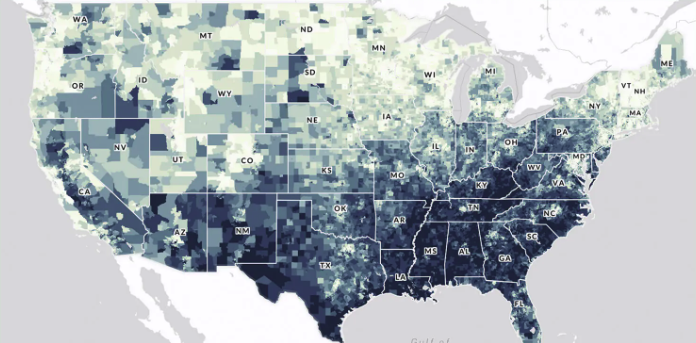
The U.S. Climate Vulnerability Index map is an interactive tool that ranks more than 70,000 U.S. census tracts using 184 indicators to show which communities face the greatest challenges from climate change. It visualizes “overall climate vulnerability” as well as underlying drivers in domains such as health, social and economic conditions, environment, infrastructure, and climate impacts (e.g., extreme events and climate disaster costs). Users can search for any location, compare tracts within a state or EPA region, and drill down to see which specific factors—like housing quality, exposure to pollution, or health burdens—are contributing to vulnerability, helping communities and decision‑makers target climate resilience investments where they are needed most.
Questions this resource can help answer
Which neighborhoods in my city or county are most vulnerable to climate change overall?
In a given tract, is climate vulnerability driven more by health, housing, income, or environmental exposures?
Where do high climate vulnerability and existing climate hazards (e.g., flooding, heat) overlap?
How does my community’s vulnerability compare to others in my state or region?
Which areas should be prioritized for climate resilience investments and community engagement?
How do I use this resource?
To use the U.S. Climate Vulnerability Index map, open the site, search for an address, city, or ZIP code, and zoom to your area of interest. View the overall vulnerability score for each census tract, then use the sidebar or layer controls to switch between different domains (e.g., health, housing, environment, climate impacts). Click on a tract to see its score, percentile, and the key indicators driving vulnerability there. You can compare nearby tracts, toggle different domains to see what’s driving risk, and export screenshots or data (where available) for reports, planning, or community discussions.
Pro tips
Start with overall vulnerability, then drill into 1–2 domains (e.g., health, housing) to avoid getting overwhelmed. Compare a tract’s state and national percentiles, not just its color, to gauge how extreme vulnerability really is. Look for clusters of high‑vulnerability tracts to identify priority corridors or neighborhoods, not just single hotspots. Use the detailed indicator list in the tract popup to see which few factors most strongly drive the score. Pair this map with local plans, flood maps, and EJ tools before making siting or investment decisions.
The U.S. Climate Vulnerability Index is built by integrating 184 publicly available indicators for every U.S. census tract and combining them into a hierarchical index. Indicators are selected with input from environmental justice community partners and grouped into seven domains: four “baseline vulnerability” domains (health, social & economic, environment, infrastructure) and three “climate change risk” domains (health, social & economic, extreme events). Each indicator is cleaned, adjusted (e.g., per‑capita or per‑area), converted to a percentile so different datasets share a common 0–100 scale, and direction‑aligned so higher values always mean greater vulnerability. Using a ToxPI-style weighted‑average method, indicators are first aggregated into subcomponents, then into domain scores, and finally into a single overall vulnerability score for each tract, with equal weighting at each step. The resulting tract‑level scores are expressed as percentiles so users can compare vulnerability within and across states and the nation.