Mapping tool that provides information on permitted facilities in New Jersey. The tool provides information on the reported emissions for each major and minor source, as well as current information on PM and ozone monitored air quality, and community vulnerability information.
This site hosts an interactive R Shiny application that explores the relationship between asthma and nitrogen oxides (NOx) pollution. Users can view and interact with charts or maps to see how asthma outcomes vary with NOx levels across locations or over time, making it easier to visualize potential links between traffic‑related air pollution and respiratory health.
The Chicago Department of Public Health (CDPH) analyzed community-level data on air quality, health, and social factors to identify neighborhoods that should be prioritized for efforts to mitigate and reduce air pollution to better protect public health. The report builds on the commitment to health and racial equity through Healthy Chicago 2025 and initiatives led by local environmental justice organizations. The aim is to provide a resource for future action on environmental health. In developing this report, they consulted with subject matter experts, advocacy groups, and community-based environmental justice organizations.
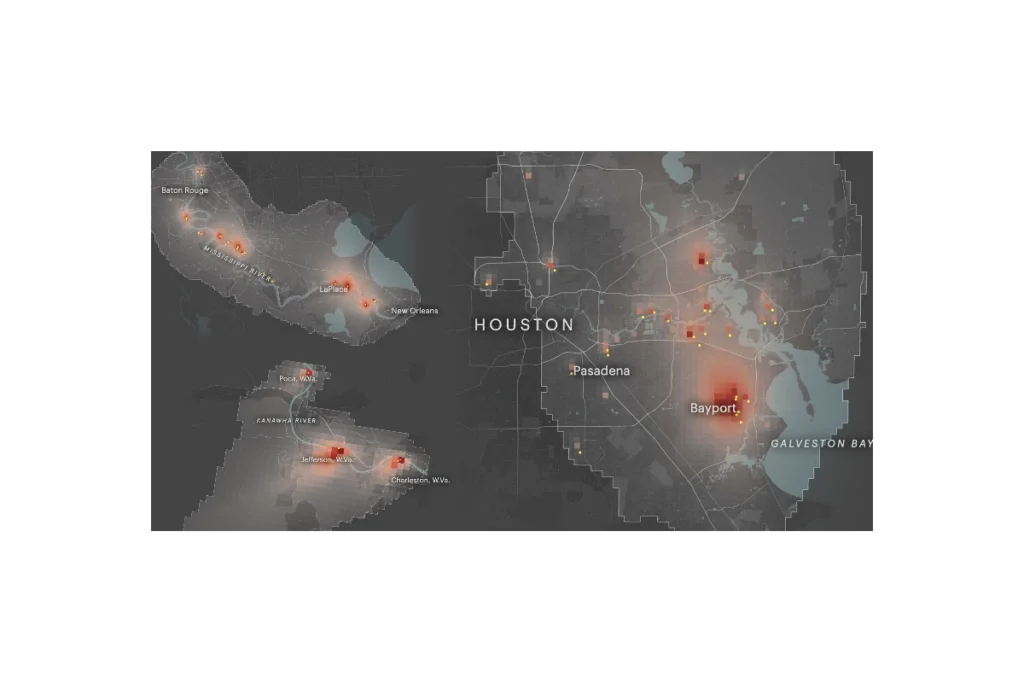
ProPublica’s Toxmap is an interactive map that visualizes estimated cancer risk from industrial air pollution across the United States. Built from EPA emissions and modeling data, it shows how toxic chemicals from thousands of facilities spread into surrounding neighborhoods, highlighting hotspots where cumulative industrial air pollution may raise cancer risk to levels the government considers unacceptable. The site lets users zoom to specific communities, see which facilities are driving risk, and explore patterns of environmental injustice in overburdened areas.
The C40 Communication Toolkit for Air Quality is a product of the best practices shared and lessons learned by these cities and is designed to help cities develop clear messaging, harness the power of visuals, and leverage digital communication channels to inspire collective action to improve air quality.
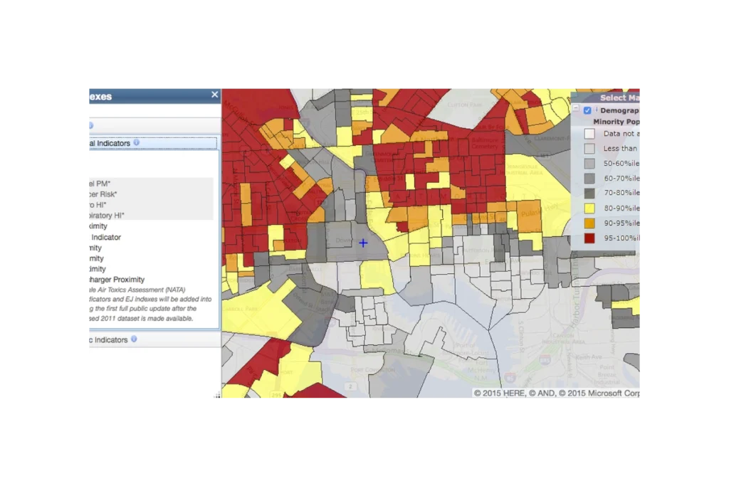
EJScreen (formerly an EPA tool, now discontinued and publicly hosted) is a national mapping and screening tool that combines environmental, health, and demographic data to help identify communities that may be disproportionately impacted by pollution and other environmental hazards. It provides interactive maps and summary reports for “EJ indexes” that blend measures like air pollution, proximity to industrial facilities, traffic, and waste sites with indicators such as income, race/ethnicity, and language isolation. Agencies, communities, and advocates use EJScreen to screen for potential environmental justice concerns, prioritize areas for further study or action, and support planning, permitting, and policy decisions.
Subscribe
Sign up to get the latest updates on new city clean air tools and resources.