Share
- Featured Resource
Toxmap
Description
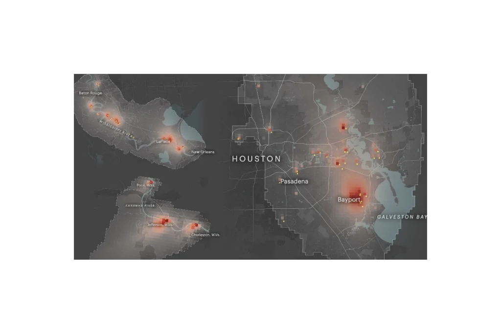
ProPublica’s Toxmap is an interactive map that visualizes estimated cancer risk from industrial air pollution across the United States. Built from EPA emissions and modeling data, it shows how toxic chemicals from thousands of facilities spread into surrounding neighborhoods, highlighting hotspots where cumulative industrial air pollution may raise cancer risk to levels the government considers unacceptable. The site lets users zoom to specific communities, see which facilities are driving risk, and explore patterns of environmental injustice in overburdened areas.
Questions this resource can help answer
- Are there industrial pollution “hotspots” near a specific address, school, or neighborhood?
- Which facilities are the biggest contributors to modeled cancer risk in this area?
- Which chemicals are driving most of the estimated industrial air‑toxics risk around my community?
- Do multiple facility plumes overlap in certain neighborhoods, suggesting high cumulative burden?
- How does the estimated cancer risk from industrial air pollution in one community compare with nearby areas or the national average shown on the map?
- Are predominantly low‑income or minority neighborhoods more likely to be located in higher‑risk plume areas?
- Where might it make sense to prioritize additional air monitoring, community organizing, or policy advocacy based on modeled risk patterns?
How do I use this resource?
To use Toxmap, open the map and type an address, city, or ZIP code to zoom to your area of interest. Once there, look at the colored risk “plume” patterns, which show modeled excess cancer risk from industrial air pollution—the darker or redder the color, the higher the estimated risk. Click on a location or facility to see details like the estimated cancer risk level, the main contributing plants, and key chemicals involved.
Pro tips
- Pair Toxmap with other tools such as EJScreen for a more complete picture of distributional impacts
- Drill down to the facility level to understand the chemicals driving the risk
Resource information
Website
Irregularly
Local, United States
Technical specifications
Toxmap is built from EPA’s own air toxics emissions and modeling data, primarily the Risk-Screening Environmental Indicators (RSEI) model and the National Air Toxics Assessment (now AirToxScreen). It takes facility-reported emissions (mainly from the Toxics Release Inventory), uses EPA’s models to estimate how those pollutants disperse in the air, and calculates the resulting incremental lifetime cancer risk for people living in surrounding census blocks. Toxmap then aggregates and visualizes these modeled risks as color‑coded “plumes” and hotspots on an interactive national map, highlighting where cumulative industrial air toxics–related cancer risk is highest. The method is screening-level: it reflects modeled estimates under standardized assumptions, not direct measurements or individualized risk assessments.