Mapping tool that provides information on permitted facilities in New Jersey. The tool provides information on the reported emissions for each major and minor source, as well as current information on PM and ozone monitored air quality, and community vulnerability information.
The Louisiana Tumor Registry website presents information about Louisiana’s statewide, population-based cancer registry, which collects detailed data on cancer cases to support prevention, early detection, treatment, and survivorship efforts. It offers resources for cancer registrars and providers on reporting requirements, and for data users—such as public health professionals, clinicians, planners, and researchers—through statistics, interactive data visualizations, cancer maps, monographs, and one-page summaries. The site also describes the Registry’s role in national programs (SEER and CDC’s NPCR), its research infrastructure (including rapid case ascertainment), and how its high-quality data are used to guide cancer control policies and reduce cancer burden and disparities in Louisiana.
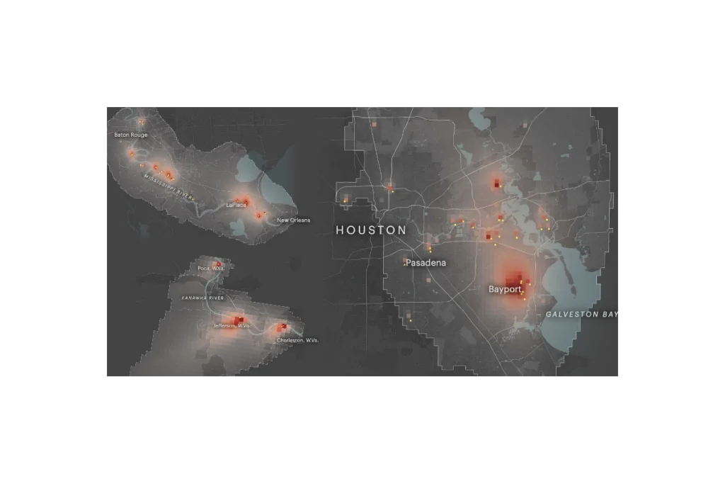
ProPublica’s Toxmap is an interactive map that visualizes estimated cancer risk from industrial air pollution across the United States. Built from EPA emissions and modeling data, it shows how toxic chemicals from thousands of facilities spread into surrounding neighborhoods, highlighting hotspots where cumulative industrial air pollution may raise cancer risk to levels the government considers unacceptable. The site lets users zoom to specific communities, see which facilities are driving risk, and explore patterns of environmental injustice in overburdened areas.
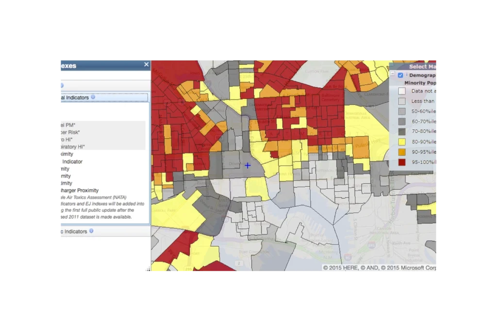
EJScreen (formerly an EPA tool, now discontinued and publicly hosted) is a national mapping and screening tool that combines environmental, health, and demographic data to help identify communities that may be disproportionately impacted by pollution and other environmental hazards. It provides interactive maps and summary reports for “EJ indexes” that blend measures like air pollution, proximity to industrial facilities, traffic, and waste sites with indicators such as income, race/ethnicity, and language isolation. Agencies, communities, and advocates use EJScreen to screen for potential environmental justice concerns, prioritize areas for further study or action, and support planning, permitting, and policy decisions.
The CDC PLACES (Local Data for Better Health) tool is a free, interactive web resource that provides model-based estimates of chronic disease, health behaviors, preventive practices, disabilities, and related social factors for small geographic areas across the United States. It offers consistent data for all counties, most cities and towns (places), census tracts, and ZIP Code Tabulation Areas, allowing users to view, map, and download neighborhood-level health information to identify local health problems, disparities, and needs and to guide targeted public health planning and policy.
Subscribe
Sign up to get the latest updates on new city clean air tools and resources.