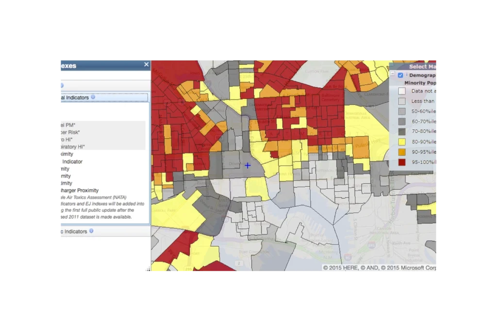
EJScreen (formerly an EPA tool, now discontinued and publicly hosted) is a national mapping and screening tool that combines environmental, health, and demographic data to help identify communities that may be disproportionately impacted by pollution and other environmental hazards. It provides interactive maps and summary reports for “EJ indexes” that blend measures like air pollution, proximity to industrial facilities, traffic, and waste sites with indicators such as income, race/ethnicity, and language isolation. Agencies, communities, and advocates use EJScreen to screen for potential environmental justice concerns, prioritize areas for further study or action, and support planning, permitting, and policy decisions.
Questions this resource can help answer
Are there neighborhoods in my city that rank very high (e.g., above the 80th or 90th percentile) for multiple EJ indexes?
How does the environmental burden in a neighborhood compare to the rest of the city or state?
Is a proposed project area already overburdened by traffic pollution, industrial facilities, or hazardous waste sites?
Which census tracts have both high air pollution levels and a high percentage of low‑income or minority residents?
Where should we prioritize community engagement or additional health and environmental monitoring?
Which areas might be strong candidates for environmental justice–focused grants or programs?
Are there patterns showing that certain racial or ethnic groups are more likely to live near high‑pollution sources in our region?”
How do I use this resource?
To use EJScreen, go to the online map, zoom to your area of interest (such as a city, neighborhood, or census tract), and turn on the environmental and EJ index layers you care about—for example, traffic proximity, particulate matter, or the overall EJ indexes. Click on specific locations or draw a custom shape to see detailed data tables for that area, including environmental indicators and demographic information. You can compare your selected area to state and national percentiles, adjust which layers are visible, and generate reports or screenshots to use in presentations, grant applications, or planning documents.
Pro tips
Use percentiles, not raw values.
Don’t overwhelm the map with too many layers, start simple.
Follow up on data insights with site visits and community input.
EJScreen combines national datasets on environmental conditions and demographics to calculate standardized “EJ indexes” at the census block group and tract level. Each environmental indicator (such as air pollution, traffic proximity, or facility density) is linked with two key demographic factors—percent low-income and percent people of color—using a formula that emphasizes places where both pollution and vulnerability are high. Data come from sources like EPA’s air and toxics models, traffic and facility inventories, and U.S. Census/American Community Survey demographics. The results are then converted to state and national percentiles so users can see how each area compares to others, making EJScreen a screening tool to flag potential environmental justice concerns rather than a detailed risk assessment.